
Challenge Social is an online social networking app which revolves around challenges. Users can create a challenge and people can upload videos of them attempting to complete it and the voting system allows people to vote for their favourite attempt.
The Challenge Social website is a chance for customers to get to know both the brand and the product, with links for users to download the Challenge Social app on their smartphones. The website also features a blog where the company can post regular updates about the business.
Discovery & Definition
The team had a few clear goals for the Challenge Social website, one of which was to educate customers on the benefits of the Challenge Social app and encourage them to download it. The other was a blog for the company to publish articles around the business. The website needed to be in keeping with the company’s brand guidelines and house style, and it was crucial it worked well on smartphones, as that’s how the majority of people would be accessing the website.
Landing Page
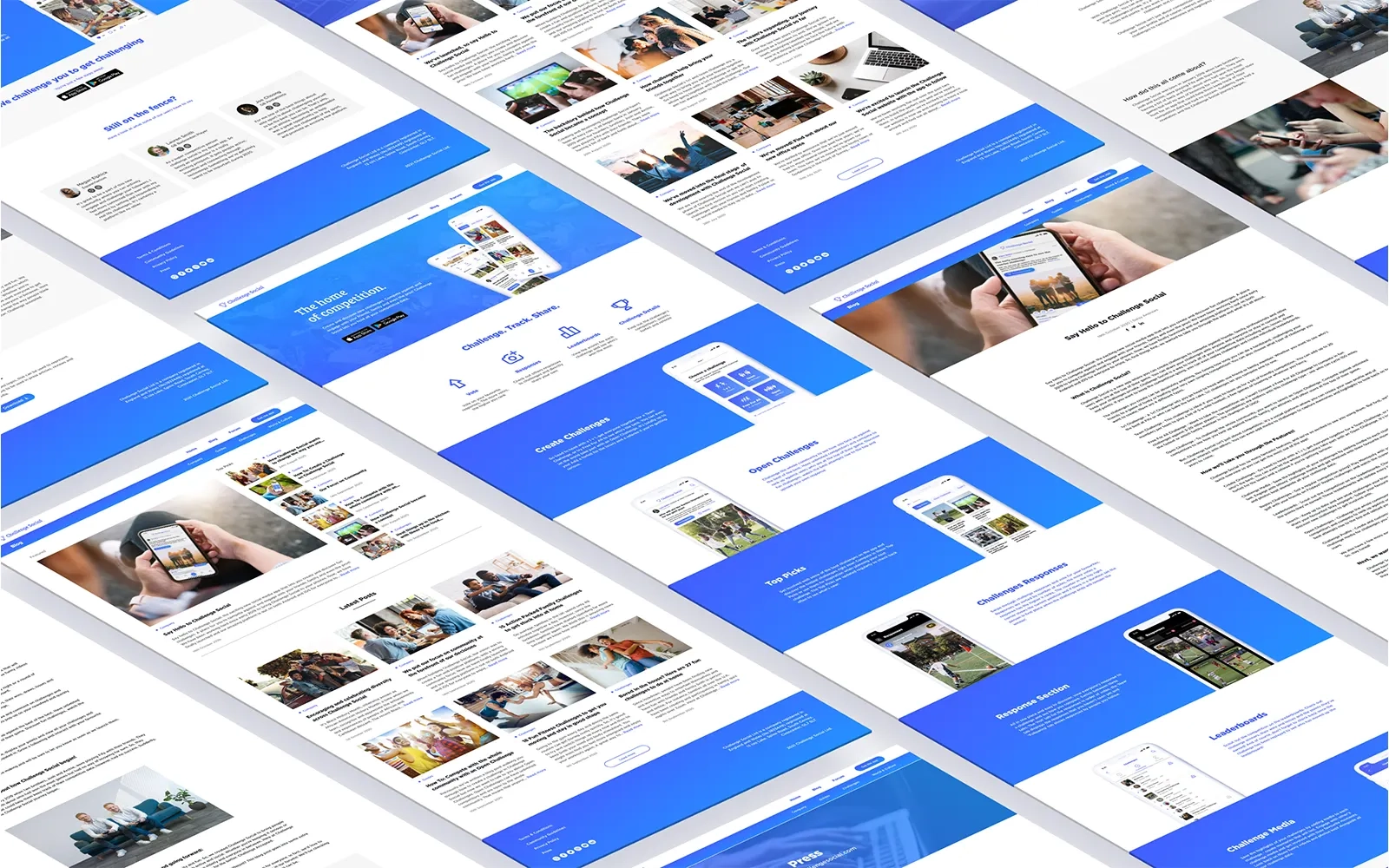
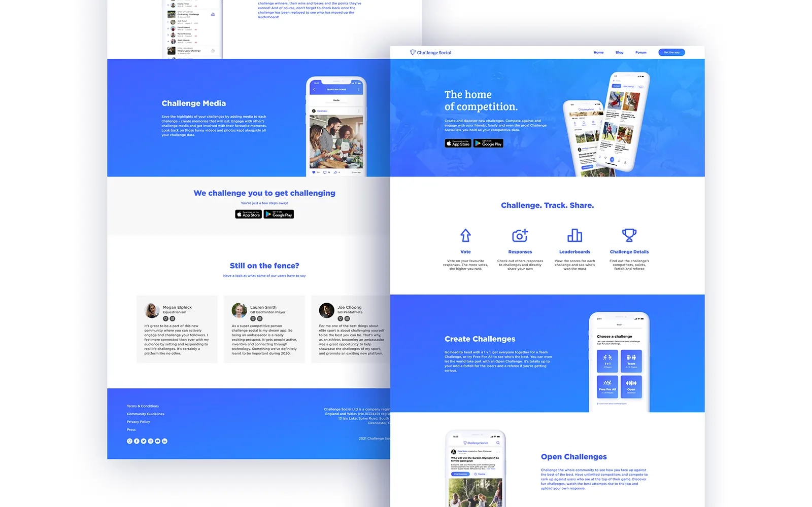
The landing page is a chance for customers to discover Challenge Social’s key features, and download the app. The ‘Hero’ section displays the company’s slogan, “The Home of Competition”, with two mock-ups of the app, a short description of the product and the App Store’s buttons to download it. The App Store buttons here are an opportunity for people who have come onto the website with the sole intention of downloading the app, to do so immediately. The next section outlines several key features of the app, each one with an icon and short description. The following sections go into more depth about the main benefits of the app. Each of these has a title, short description and a mock-up of the relevant screen from the app, so people can get a feel for the product. After the features sections, there is a call to action to download the app, followed by reviews for customers who might still be unsure that the app is for them.
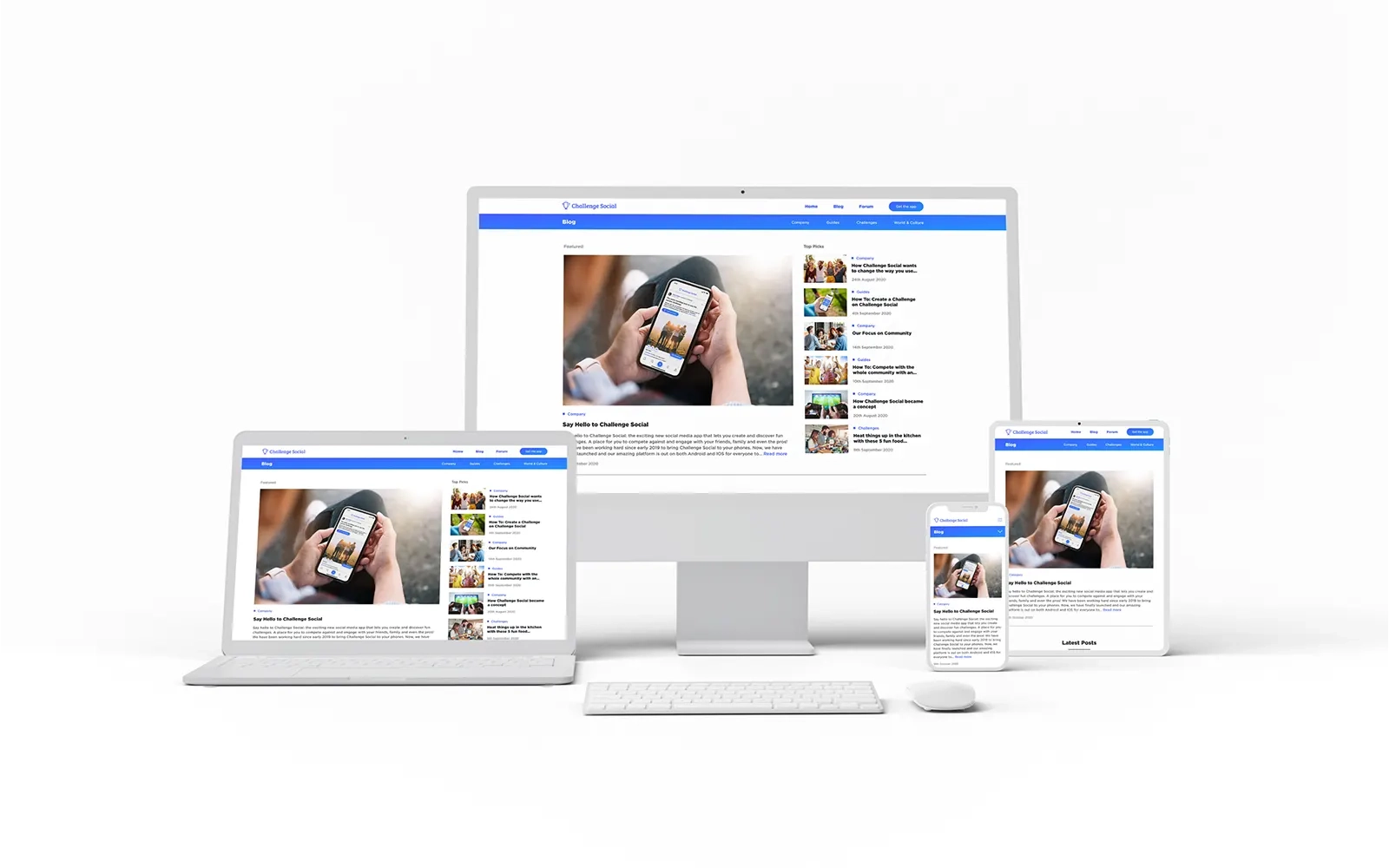
Blog
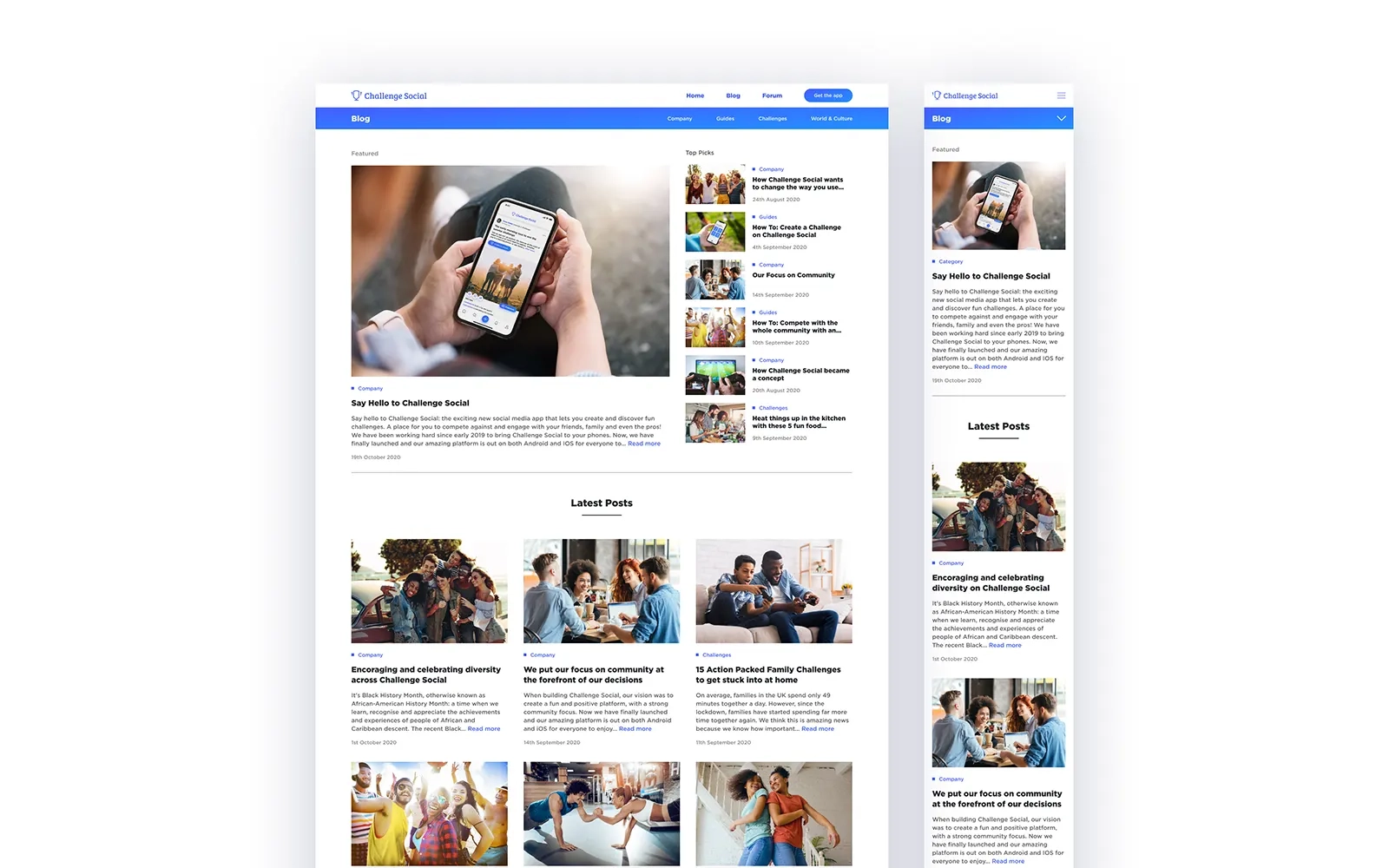
The main blog page is a chance for customers to find out more about the Challenge Social through a series of articles published by the company. The section at the top is broken into two columns. The first features a large image preview of the company’s most recent post. The other column features several small previews of blog posts the company has decided to pin here. The section below displays previews of the rest of the company’s posts, sorted by newest first. Each preview includes an image of the post, which category it falls into as well as the title, a short excerpt from the article and the date it was published.
Blog Category Page
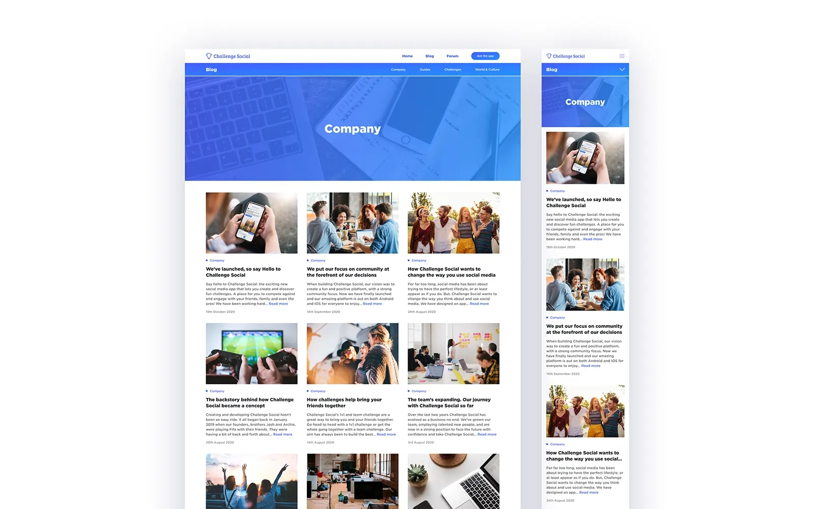
Across each of the blog pages on the website, there is an additional navigation bar which links to each of the blog categories. This is a chance for readers to discover the post they are particularly interested in. Each category page features a header with the name of the category in the centre. The headers feature a relevant image to each category, with the company’s gradient overlaid on top. The post previews displayed below this are consistent with the main blog page.
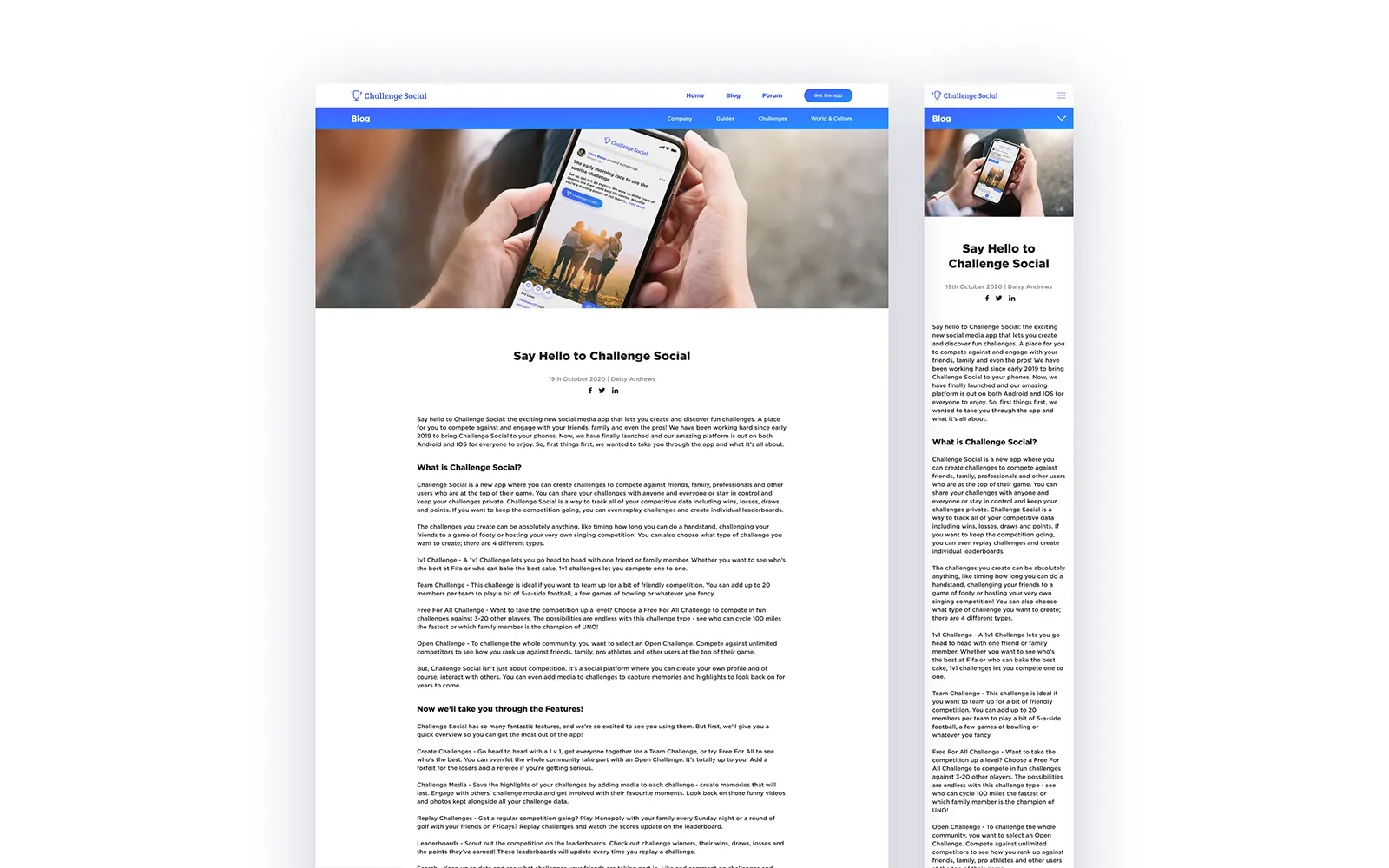
Blog Article Page
Each blog article page has a feature image related to the article, as well as the contents of the article and links to share it across social media.
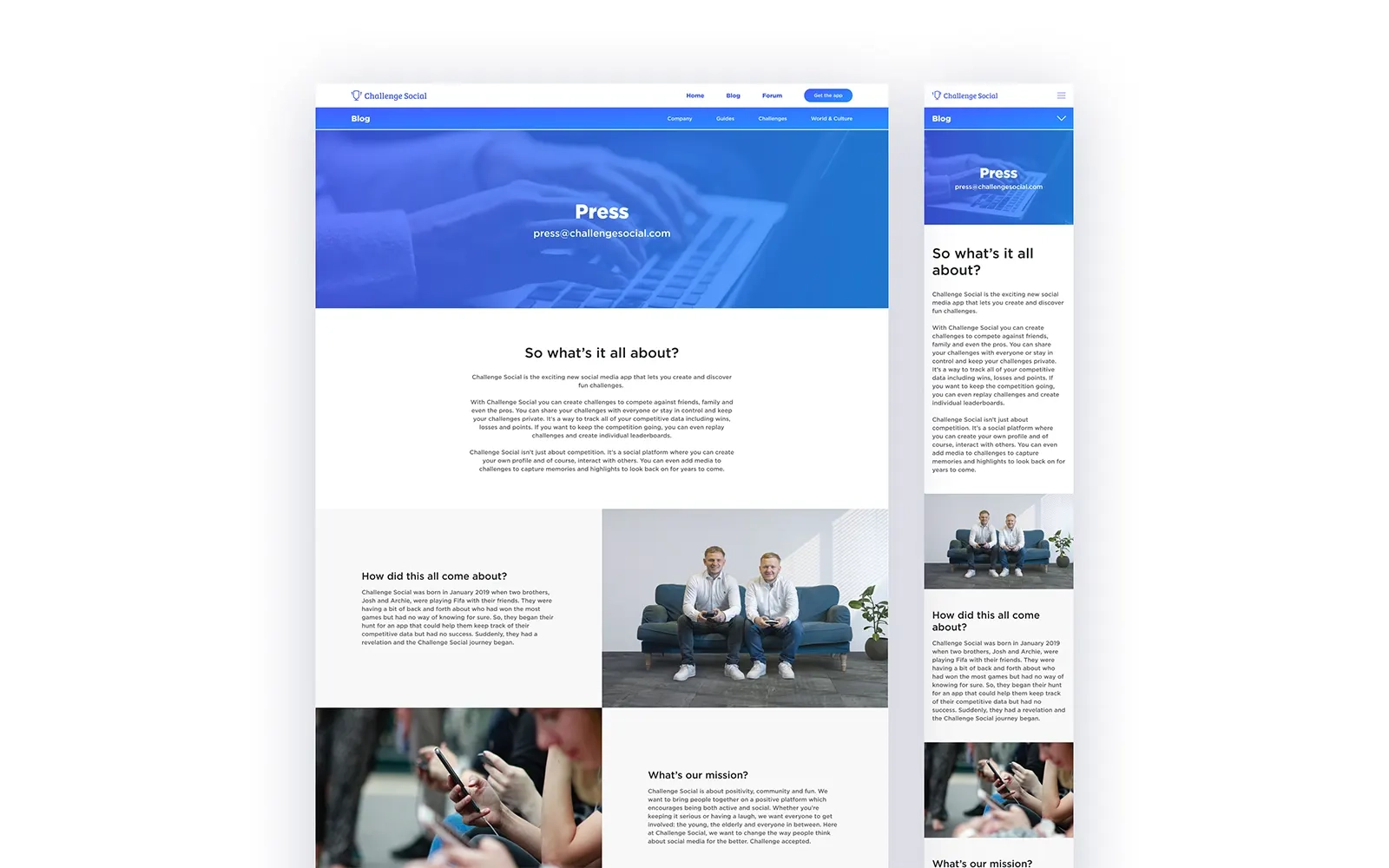
Press Page
The press page is an opportunity for journalists and media organisations to find out key information about the brand and its history, as well as contact information and links to download the company’s press kit. The header image is consistent with the blog category pages, using the same image and gradient overlay effect.

Creating the Interface
The interface for the Challenge Social website was originally created using Adobe XD, but during the course of creating the website, the designs were moved to Figma in order to benefit from the better features and reliability it offered. Each of the pages was created in a variety of screen sizes in order for the front end developer to build the website in a responsive way, which was vital for the company as the majority of the traffic was expected to come from mobile devices. Many elements of the design were created as components within Figma. This allowed the design to be built quicker, as when you update the main components, the rest update automatically. Also, font sizes and colours were created as styles, so they could be applied as needed, ensuring consistency across the design.
The Result
The final version of the website has successfully achieved the company’s goals, and has helped to drive traffic to the App Store and ultimately boost the number of downloads the company receives.